

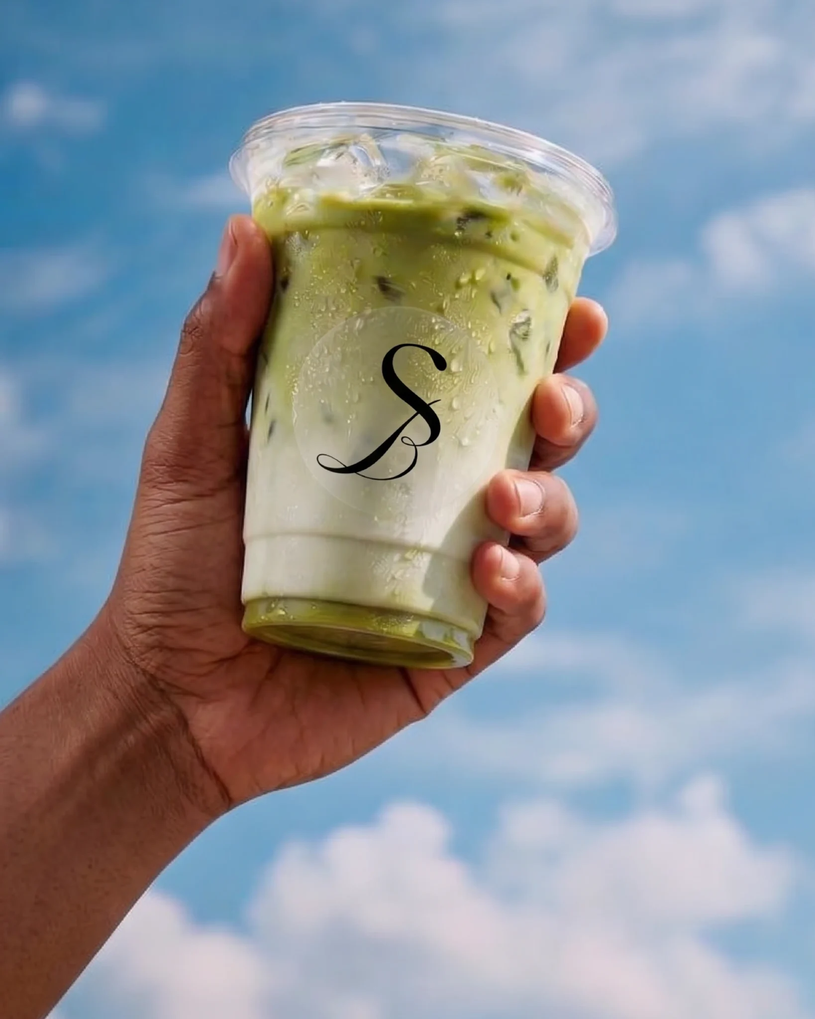
- Brand Identity
- 2026
- Sisters’ Brew
Overview
Sisters’ Brew needed a visual identity that could feel personal and expressive while still carrying the polish required for a modern consumer brand.
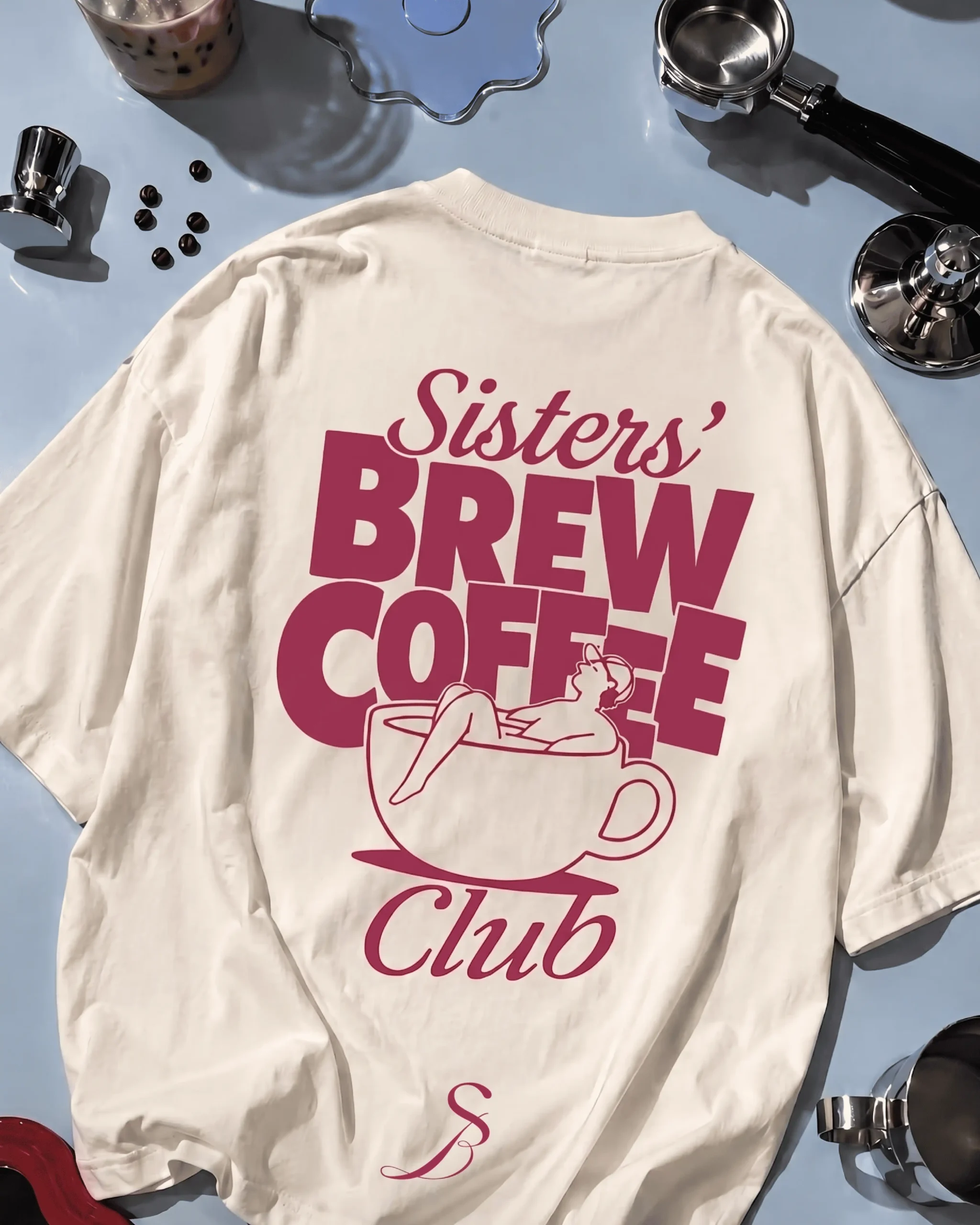
We developed an elegant monogram-led system, pairing a fluid “S” symbol with restrained typography and a warm, confident colour palette. The result is an identity that feels distinctive, feminine and premium without becoming overly decorative.
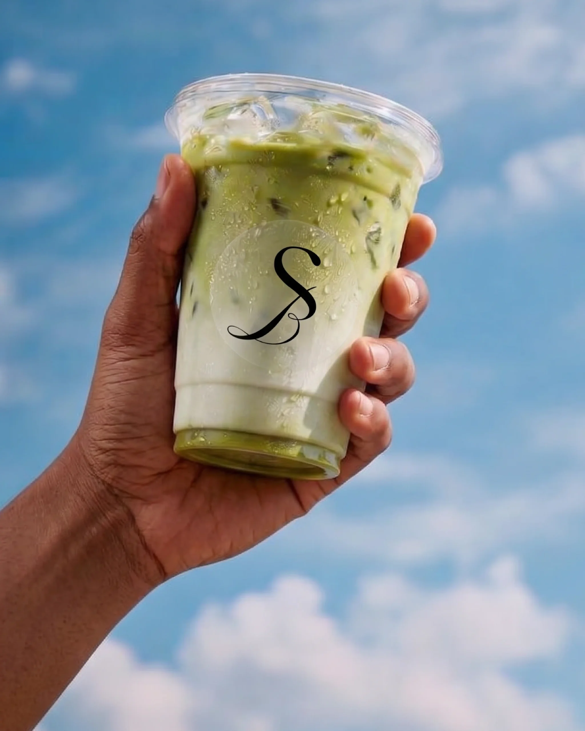
Designed to translate naturally across packaging, cups, digital content and future retail touchpoints, the system gives Sisters’ Brew a recognisable foundation for growth.


“We called Imagine Clany Eco when another company cancelled on us last minute for our move-out cleaning. Clany Eco was able to book us and make it out in 2 hours and did an amazing job. We even got our deposit back.”
John Smith, CEO & Owner Tweet