

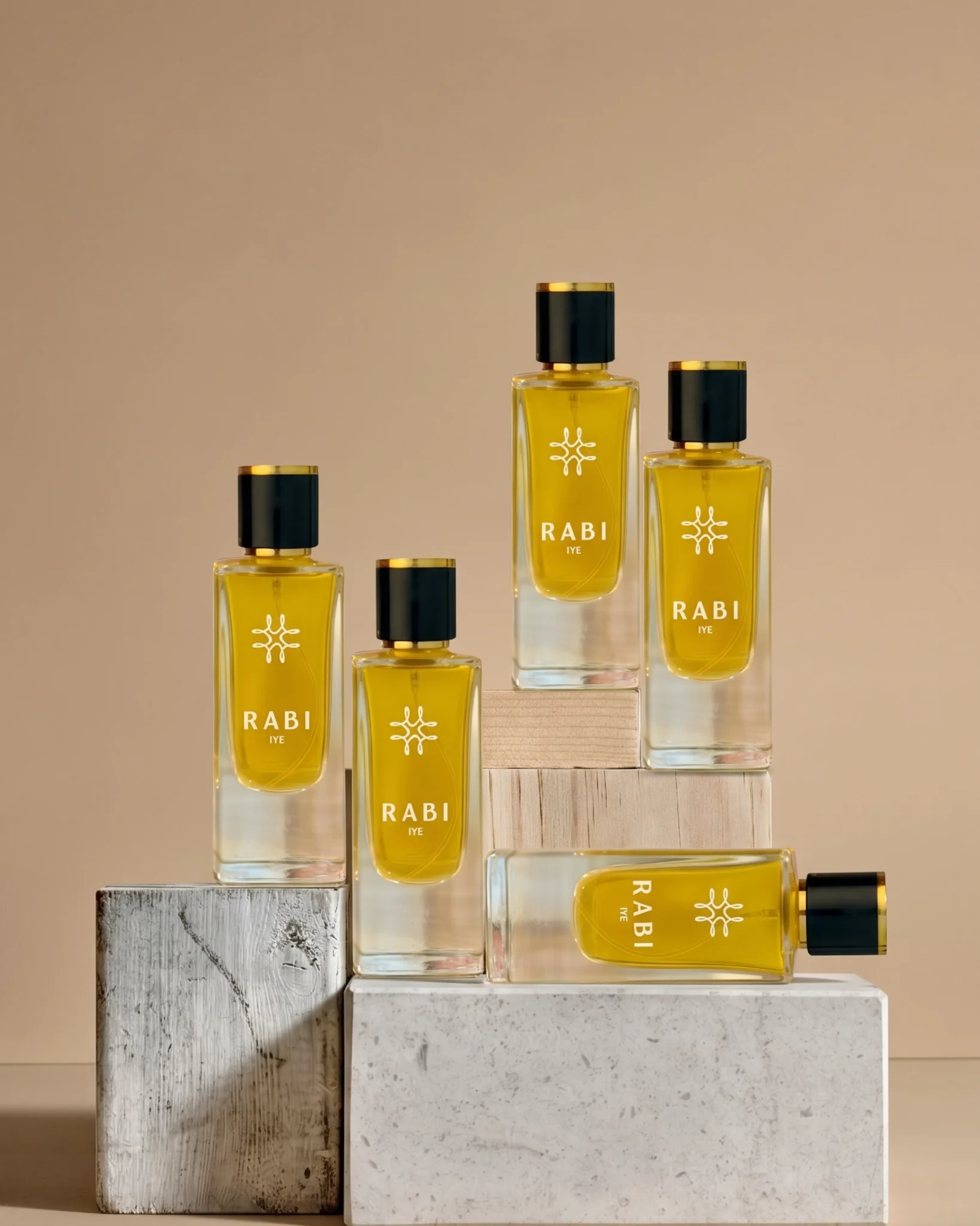
- Brand Identity
- 2026
- Rabi Fragrances
Overview
Rabi needed an identity that could feel refined, memorable and unmistakably its own within a highly competitive fragrance category.
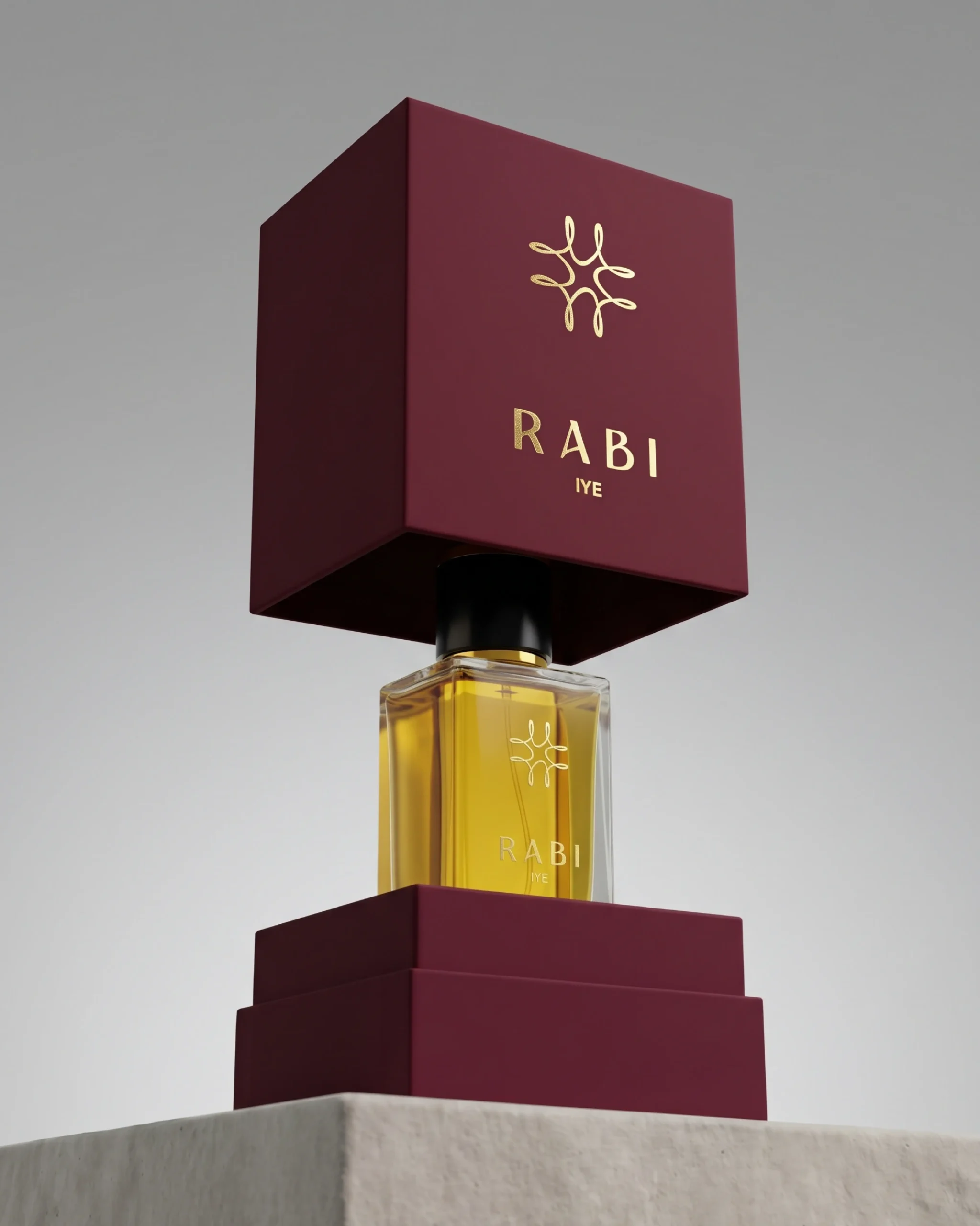
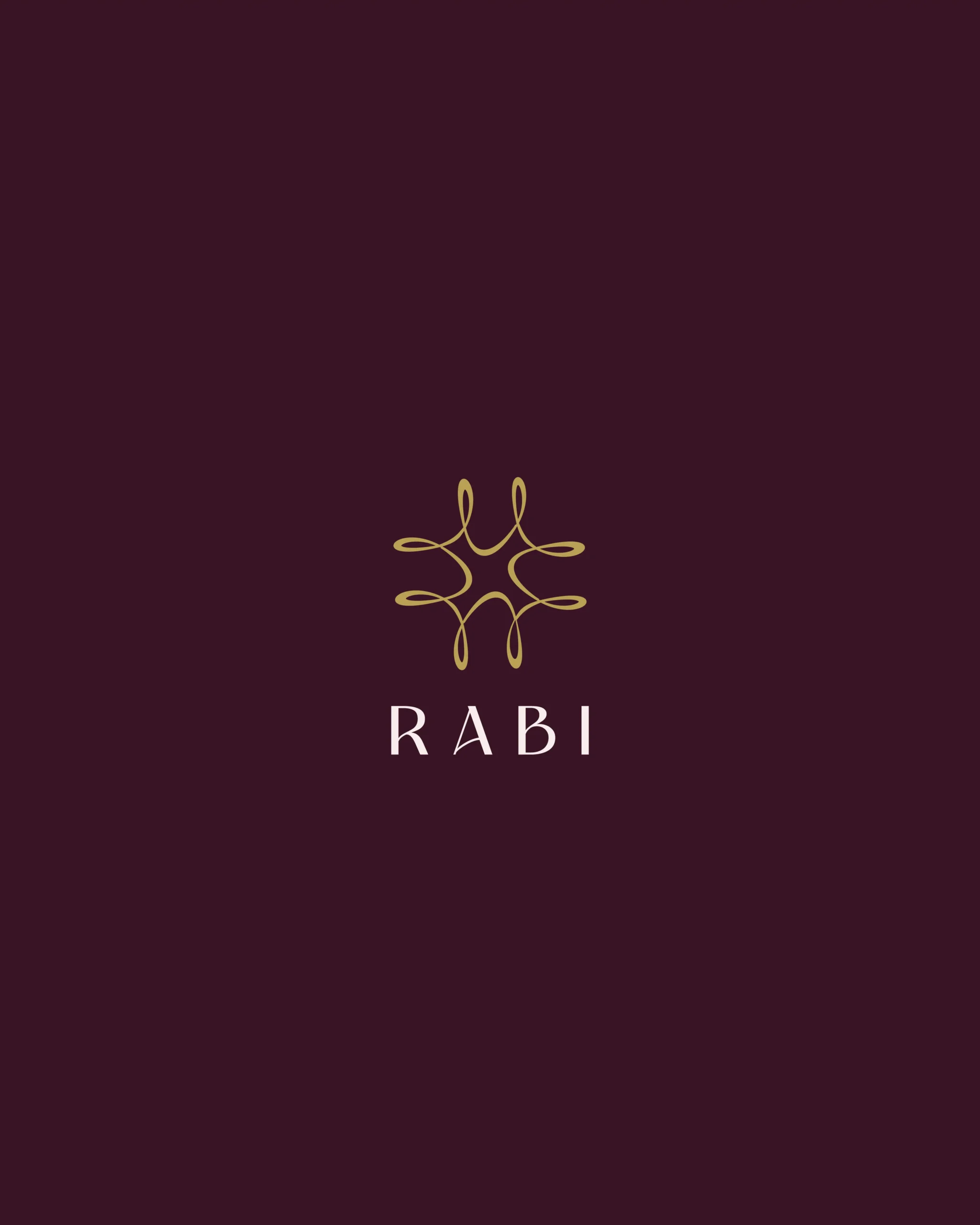
At the centre of the system is a custom symbol constructed from the letters R, A, B and I, brought together into a single continuous form. The result is a mark that feels elegant and expressive, while giving the brand a deeper layer of meaning and ownership.
Paired with a refined wordmark and a rich, understated palette, the identity gives Rabi a distinctive visual language designed to extend across packaging, retail and digital touchpoints.


“We called Imagine Clany Eco when another company cancelled on us last minute for our move-out cleaning. Clany Eco was able to book us and make it out in 2 hours and did an amazing job. We even got our deposit back.”
John Smith, CEO & Owner Tweet